In this article, you will know about 5 best free online visualization tools. You may visualize and analyze data in the form of mathematical graphs and charts by using these free web services. These web services allow you to manually enter dataset or import local spreadsheets and plot data series on the graph. You get columns, bar, line, area, scatter, pie, donut, histogram, 3D scatter, 3D line, 3D mesh, 3D surface, cone, steamtube, candlestick, OHLC, etc. There are many more graphs for the data visualization which you can explore by using these online data visualization tools. You may customize appearance of output graph and export graph as scalar image, vector image, etc. Plus, you can generate an embed code for final graph.
Let us see what are these free online data visualization tools:
ChartBlocks:
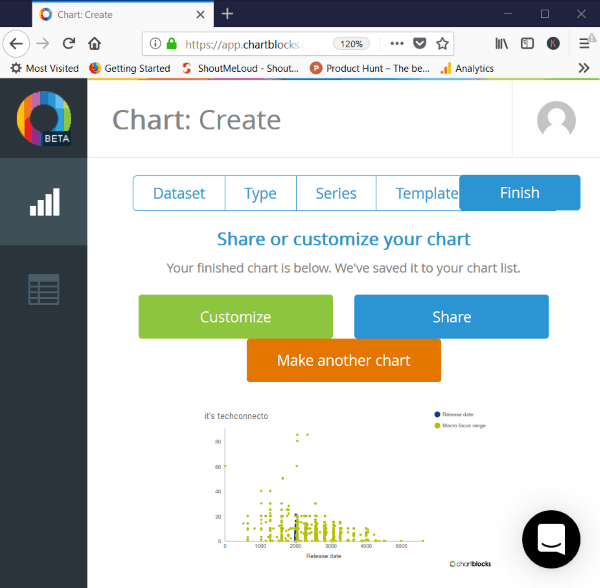
ChartBlocks is a free online data visualization tool. It contains 50 charts to visualize data online in the free version. It allows you to manually enter a dataset or import a spreadsheet into this tool. The maximum size to import a spreadsheet is 50MB. It previews the dataset before creating a chart. It primarily contains graphs such as columns, bar, line, area, scatter, pie, donut, election, etc. Choose a desired graph type, then select data series with two columns per series to plot on the graph. You may also select some advanced settings such as range of row, use sum of values, average value, count, min, max, etc. It allows you to choose a desired template to plot the selected graph.
The final graph can also be customized. You may customize line thickness, point shape, point size, background color, axes, legend settings, data labels. It allows you to save graph to EPS, PS, PNG, PDF, SVG files. It also allows you to share on Twitter, Facebook, and Pinterest and also generates a public link and embed code.
Note: You need to register a free account to use this web service.
RAW Graphs:
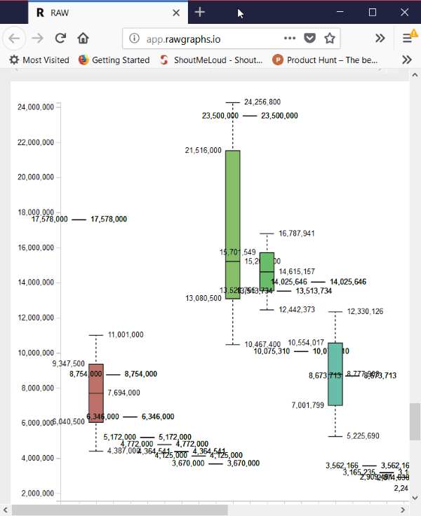
RAW Graphs is a free tool to visualize statistical data. You may visualize and analyze data by using various graphs. It allows you to copy and paste data, upload a local file, enter a file URL, or try its sample examples.
Here is a list of the graphs offered in it: Contour Plot, Convex Hull, Hexagonal Binning, Scatter Plot, Voronoi Tessellation, Beeswarm Plot, Box Plot, Circular Dendrogram, Cluster Dendrogram, Circle Packing, Sunburst, Treemap, Alluvial diagram, Parallel coordinate, Bar Chart, Pie Chart, Gantt Chart, Area Graph, Bump Chart, Horizon Graph, StreamGraph.
You may choose any of these graphs based on your requirements and after that, drag X axis, Y-axis, label, etc. dimensions for mapping. It allows you to customize visualization like width, height, series order, color scale, etc. You may download graph in the form of SVG, PNG, Data Model (JSON) file formats.
Statpedia:
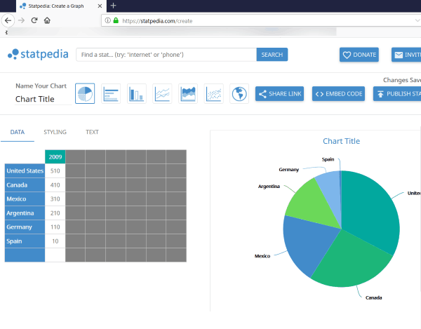
Statpedia is a free online data visualization tool. You may manually enter data in it and visualize data using graphs like bar, pie, line, scatter, etc. It allows you to customize graph styling, text, map type, map codes. You can share link of graph or generate an embed code for the same.
Plotly:
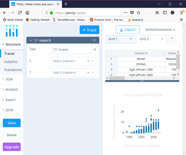
- Simple: Scatter, bar, line, area, heatmap, table, contour, pie.
- Distribution: Box, violin, histogram, 2D histogram, 2D contour histogram.
- 3D: 3D scatter, 3D line, 3D mesh, 3D surface, cone, steamtube.
- Maps: Choropleth, satellite map, atlas map.
- Finance: Candlestick, OHLC.
- Specialized: Polar scatter, polar bar, ternary scatter.
Vizzlo:
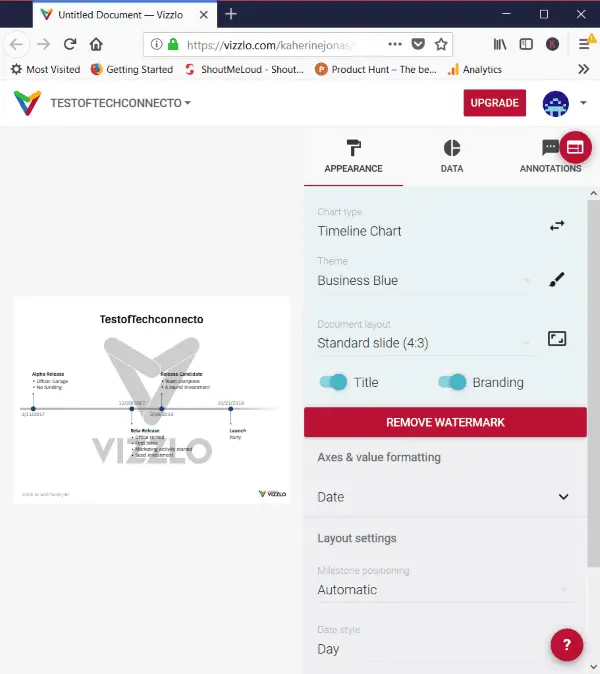
Vizzlo is a free online data visualizer tool. You may visualize manually entered data and local spreadsheet files. It allows you to analyze data in form of graphs such as timeline chart, project phase chart, Gantt chart, waterfall chart, organizational chart, dot plot chart, grouped bar chart, pie chart, SWOT analysis, donut chart, word cloud, hourglass, Venn diagram, and many more charts. You may customize the appearance of the graph and annotate it. It allows you to export as PNG image, share the graph, and generate an embed code for it. The graph output contains a watermark.
Conclusion:
So these are 5 web services which allow you to visualize data in the form of various graphs. You may also customize graph appearance, analyze graph using various options, save the final graph to your PC. I personally liked ChartBlocks the most. You can try these web services and plot your data to clearly analyze it.
Also, see:
- Online World Weather Forecast and Visualization Service
- Do Twitter Sentiment Analysis for Free Online, Download Report in CSV